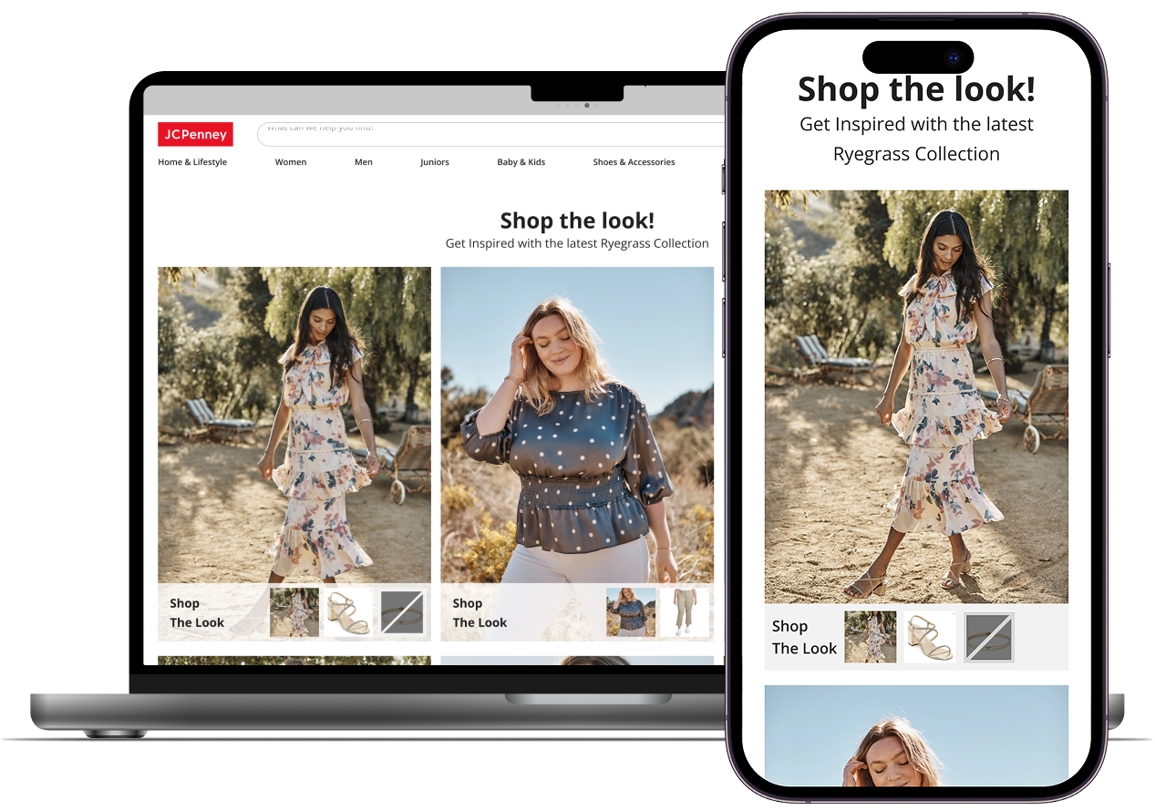
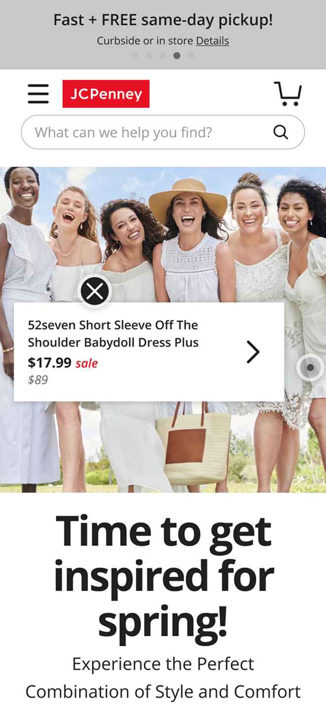
From Inspiration to Add-to-Cart

Turning editorial into measurable revenue at JCPenney

Quick Summery

(30 Second Read)

Problem

JCPenney’s editorial imagery inspired shoppers, but customers couldn’t easily tell which items were purchasable or quickly shop the full look, creating a discovery and conversion gap across Homepage, PLP, and PDP placements.

Solution

I designed and validated a scalable Shoppable Image widget experience that makes shoppability obvious and lets users explore & buy items without leaving the page via a conversion-first interstitial modal.

Impact

• +12.5% higher Add-to-Cart rate vs. site baseline

+2.51% higher conversion among users who engaged with the widget vs. site baseline

My Role

As the sole UX/UI designer, I owned the end-to-end Shoppable Image experience from concept to validation and handoff. I delivered the full solution (mobile + desktop) in under 6 weeks, working within JCPenney’s existing design system and partnering closely with Product, UX Research, Engineering, and Marketing.

My Process

To ensure the solution was both intuitive for users and aligned with business goals, I followed a research-backed, iterative design approach:
  1. Competitive analysis to identify existing “shop the look” patterns and UX pitfalls.
  2. Wireframes to hi-fi UI built within JCPenney’s existing design system.
  3. Three concepts & prototyping (Global icon vs. Pins) for mobile & desktop user testing.
  4. Synthesis & iteration based on findings to land on the final hybrid direction and prep for handoff.

Deep Dive

Context

JCPenney wanted to better monetize editorial and marketing content. At the time, the brand was investing heavily in high profile designer collaborations (e.g., Prabal Gurung, Ashley Graham) and producing premium editorial photography to promote these collections. The goal was to transform that inspirational content into clear product discovery and measurable sales so the investment in content directly translated into shopping outcomes.

Constraints

Tight timeline :

Initial concepts & competitive analysis delivered within 2 weeks in order to allow time for the research time to conduct usability testing and allow time for me to itierate based on initial user testing outcomes and feedback.

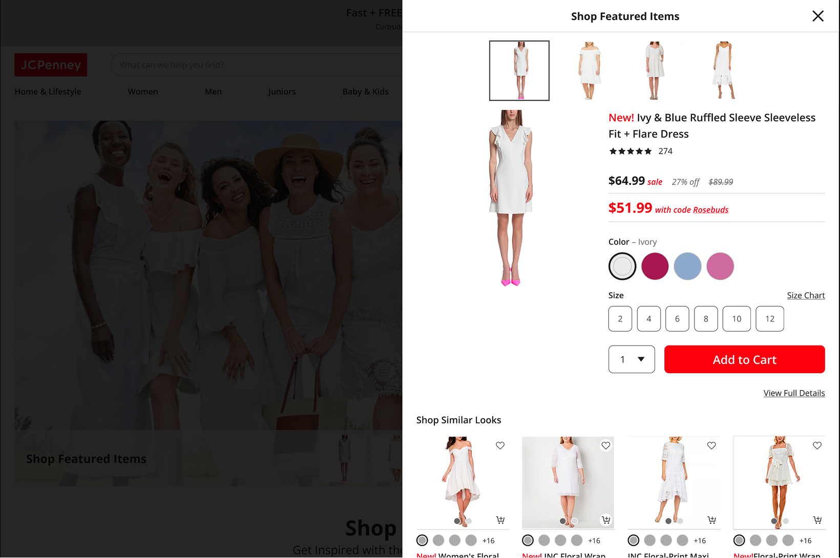
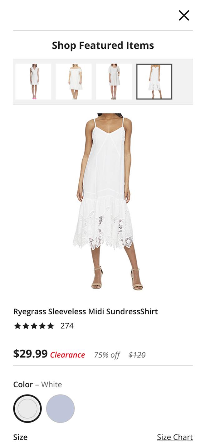
Required use of JCPenney’s existing design system:

• Although “shoppable image” plugins already existed, JCPenney wanted to avoid the time and bureaucracy of vetting a third-party vendor.

• Instead, the team chose to build a proprietary solution to accelerate go-live. As a result, I designed the experience tightly within JCPenney’s existing design system and component patterns to minimize engineering effort and speed up implementation.

Competitive Analysis

Analysis:

In order to get a deeper understanding of how different competitors impleneted a “shoppable image” experience I analyzed 16 retailers who had some sort of shoppable image experience on the site.
After the analysis, two main design patterns showed up everywhere. Competitors were split between two interaction models, global ‘Shop All’ vs. Pins/Hotspots. Taking this into account I created two seperate designs using JCPenny’s design system in order to validate with the research team which would be the best approach and get user insights.
EX: Pins/Hotspots
EX: Global ‘Shop All’ icon

Iteration 1.0 - Global Flow & Pin Flow

Competitive analysis revealed two dominant patterns: Global ‘Shop All’ vs Pins. Using JCPenney’s design system, I built two similar flows across mobile and desktop, then partnered with UX Research to validate discoverability, comprehension, and shopping intent.

Global Icon Flow: Clean, but relies on discoverability

  1. Single icon opens interstitial showing all shoppable items
  2. Lowest editorial disruption
  3. Risk: icon must be noticed and understood

Desktop

(Default)

Desktop

(Interstitial Modal Activated)
  1. Built on existing mini-PDP pattern to stay consistent with the design system
  2. Extended it to support multiple products within the interstitial for “shop the look”

Mobile

(Default)

Mobile

(Interstitial Modal Activated)

Pin Flow: Highly discoverable, but creates an expectation gap

  1. Contextual pins show item-level info scent (price/sale)
  2. Higher discoverability
  3. Risk: adds visual noise and can create ‘I need size/color/availability’ friction.

Desktop

(Default)

Desktop

(Interstitial Modal Activated)

Hover reveals info → Click opens interstitial

Mobile

(Default)

Mobile

(Product Card Activated)

Mobile

(Interstitial Modal Activated)

Hover reveals info → Click opens interstitial

Next: usability testing validated which model users noticed, understood, and trusted enough to shop.

Round 1 Usability Testing Outcomes: Global vs. Pins

What we tested

We evaluated two interaction models to understand:
  1. Discoverability: Do users notice the shoppable affordance?
  2. Comprehension: Do users understand what will happen if they interact?
  3. Shopping intent: Does the experience increase motivation to explore and buy?

Method

  1. Unmoderated usability testing (mobile + desktop)

Key insight: Don’t raise purchase intent without answering purchase-critical questions (size/color/availability).

Global icon flow:
Low discoverability & low clarity

What we observed

  1. Users rarely noticed the global icon (desktop + mobile).
  2. When noticed, its purpose was unclear and didn’t motivate interaction.
  3. Confusion reduced engagement.
  4. Some participants felt stuck during the test.

What this meant

A clean editorial treatment wasn’t enough, the experience needed a clearer, more self-explanatory entry point that didn’t rely on users “finding” an icon.

Pin flow:
Immediate comprehension, but a trust eroding expectation gap

What we observed

  1. Users immediately understood what was shoppable.
  2. Price/sale info increased interest and intent to buy.
  3. But apparel needs variants; missing size/color/availability created frustration.
  4. Excitement often turned into disappointment when preferred options weren’t available.

What this meant

A clean editorial treatment wasn’t enough, the experience needed a clearer, more self-explanatory entry point that didn’t rely on users “finding” an icon.

Decisions & Next Steps

Testing made the direction clear:
  1. We needed pin-level discoverability (shoppability must be obvious).
  2. We also needed purchase-ready answers (variants/availability) to avoid frustration.

This directly led to the Hybrid model: Shoppable thumbnails beneath the image for immediate clarity, paired with a conversion-first interstitial modal that surfaces sizes/colors/availability and supports Add to Cart without leaving the page.

Hybrid Iteration 2.0 - The solution that solved both issues

Round 1 testing made the path forward clear: we needed pin-level discoverability without the frustration caused by missing purchase-ready details. The Hybrid model combines both, clear shoppability upfront, and complete answers at the moment of intent.

Desktop - Layout Option #1
(Hero image + thumbnails)

The hybrid pattern introduces shoppable thumbnails beneath the editorial image so users immediately understand what’s purchasable—without adding visual noise to the image itself.
  1. Instant clarity: thumbnails make “Shop the Look” obvious at a glance
  2. Editorial stays premium: the hero image remains clean and distraction-light
  3. Fewer dead-ends: users aren’t teased with partial info before seeing variants/availability

Interstitial modal (conversion-first)

To eliminate the “I want it… but can I actually buy it?” moment, the interstitial provides purchase-critical details without leaving the page:
  1. Variants + availability: size/color options surfaced immediately
  2. Primary CTA: Add to Cart
  3. Secondary CTA: View Full Details
  4. Multi-product browsing: users can switch between featured items via thumbnails while staying in context

Mobile

(Hero Image Implementation)

Mobile

(Interstitial Modal Activated - Improvement)

Desktop

(Default)

Desktop

(Interstitial Modal Activated)